Showing posts with label infragistics. Show all posts

Nov 2, 2010

How to sort columns in Infragistics WinGrid

This code demonstrates how WinGrid allows the user to sort on both single and multiple columns by clicking on the column headers. The UltraWinGrid allows user to sort by setting the .HeaderClickAction property to either .SortSingle or .SortMulti.

Below are the steps to achieve the same

1. Adding using/imports directives
VB:


Imports Infragistics.Win.UltraWinGrid

C#:
using Infragistics.Win.UltraWinGrid;


2. The InitializeLayout event of UltraGrid sets the default HeaderClickAction for all bands and all columns

VB:
Private Sub UGSort_InitializeLayout(ByVal sender As Object, _
  ByVal e As Infragistics.Win.UltraWinGrid.InitializeLayoutEventArgs) _
  Handles UGSort.InitializeLayout
   e.Layout.Override.HeaderClickAction = HeaderClickAction.SortSingle
End Sub


C#:
private void UGSort_InitializeLayout(object sender, 
  Infragistics.Win.UltraWinGrid.InitializeLayoutEventArgs e)
{
 e.Layout.Override.HeaderClickAction = HeaderClickAction.SortSingle;
}


3. The code in the Button Click event instructs the UltraWinGrid to sort on band 1 column 2 in Descending order

Visual Basic:
Private Sub btnSortBand1Column2_Click(ByVal sender As System.Object, _
  ByVal e As System.EventArgs) Handles btnSortBand1Column3.Click
 Me.UltraGrid1.DisplayLayout.Bands(1).Columns(2).SortIndicator = _
   SortIndicator.Descending
End Sub


C#:
private void btnSortBand1Column2_Click(object sender, EventArgs e)
{
 this.ultraGrid1.DisplayLayout.Bands[1].Columns[2].SortIndicator = 
   SortIndicator.Descending;
}

How to choose column chooser feature in Infragistics Wingrid

This code demonstrates using the Column Chooser functionality to display a dialog similar to Microsoft Outlook's Field Chooser where the user can choose columns to display in the WinGrid. 

Now, lets start with the step by step process of how we can achieve the same

1. Add using/imports directives 
VB:


Imports Infragistics.Win
Imports Infragistics.Win.UltraWinGrid


C#:
using Infragistics.Win;
using Infragistics.Win.UltraWinGrid;


2. The WinGrid has in-built RowSelectorheaderstyle property to choose the column button which will display a button in the row selector area. You can change the appearance of it by RowSelectorHeaderAppearance property.

VB:
' Set the RowSelectorHeaderStyle property to ColumnChooserButton.
Me.UltraGrid1.DisplayLayout.Override.RowSelectorHeaderStyle = _
  RowSelectorHeaderStyle.ColumnChooserButton

' Enable the RowSelectors. 
Me.UltraGrid1.DisplayLayout.Override.RowSelectors = DefaultableBoolean.True

' If you want to change the BackColor of the button then you need to
' set the ThemedElementAlpha property to Transparent otherwise BackColor setting won't be ' honored. 
Me.UltraGrid1.DisplayLayout.Override.RowSelectorHeaderAppearance.ThemedElementAlpha = Alpha.Transparent
Me.UltraGrid1.DisplayLayout.Override.RowSelectorHeaderAppearance.BackColor = Color.Blue


C#:
// Set the RowSelectorHeaderStyle to ColumnChooserButton.
this.ultraGrid1.DisplayLayout.Override.RowSelectorHeaderStyle = 
  RowSelectorHeaderStyle.ColumnChooserButton;

// Enable the RowSelectors. 
this.ultraGrid1.DisplayLayout.Override.RowSelectors = DefaultableBoolean.True;

// If you want to change the BackColor of the button then you need to
//set the ThemedElementAlpha property to Transparent otherwise BackColor setting won't be //honored. 
this.ultraGrid1.DisplayLayout.Override.RowSelectorHeaderAppearance.ThemedElementAlpha = Alpha.Transparent;
this.ultraGrid1.DisplayLayout.Override.RowSelectorHeaderAppearance.BackColor = Color.Blue;


3. You can also have your own user interface for displaying the column chooser. UltraGridColumnChooser is derived from .NET Control class. It displays list of columns & implements drag-n-drop functionality. ColumnChooserDialog derives from .NET Form class. It simply embeds UltragridColumnChooser inset it. 

The following code demonstrates how to display column chooser dialog.

Visual Basic:
' Create an instance of the ColumnChooserDialog.
Dim dlg As ColumnChooserDialog = New ColumnChooserDialog()

dlg.Owner = Me

Dim cc As UltraGridColumnChooser = dlg.ColumnChooserControl

' Associate a WinGrid to the column chooser. 
cc.SourceGrid = Me.UltraGrid1

cc.CurrentBand = Me.UltraGrid1.DisplayLayout.Bands(0)

cc.Style = ColumnChooserStyle.AllColumnsWithCheckBoxes
cc.MultipleBandSupport = MultipleBandSupport.SingleBandOnly

' Set location, size etc...
dlg.Size = New Size(150, 300)

dlg.Show()


C#:
// Create an instance of the ColumnChooserDialog.
ColumnChooserDialog dlg = new ColumnChooserDialog( );

dlg.Owner = this;

UltraGridColumnChooser cc = dlg.ColumnChooserControl;

// Associate a WinGrid to the column chooser. 
cc.SourceGrid = this.ultraGrid1;

cc.CurrentBand = this.ultraGrid1.DisplayLayout.Bands[0];

cc.Style = ColumnChooserStyle.AllColumnsAndChildBandsWithCheckBoxes;
cc.MultipleBandSupport = MultipleBandSupport.SingleBandOnly;

// Set location, size etc...
dlg.Size = new Size( 150, 300 );

dlg.Show( );

How to bind WinGrid to obtain a card view layout - Infragistics

This code shows how to obtain a card view layout with the help of Infragistics WinGrid. WinGrid helps you to easily print and export your data in the form of excel or PDF document.

1. Bind grid to a DataSource (Same as we do in usual Gridview)
wingrid1

2. Now we need to obtain a card view layout which can be achieved by properties of Displaylayout object

VB:


'You must set this property in order to print in card view.
Me.UltraGrid1.DisplayLayout.AllowCardPrinting = _
   Infragistics.Win.UltraWinGrid.AllowCardPrinting.RootBandOnly

'Display WinGrid in card view.
Me.UltraGrid1.DisplayLayout.Bands(0).CardView = True

'Set a caption for each card using the CompanyName field.
Me.UltraGrid1.DisplayLayout.Bands(0).CardSettings.CaptionField = "CompanyName"


C#:
//You must set this property in order to print in card view.
this.ultraGrid1.DisplayLayout.AllowCardPrinting = Infragistics.Win.UltraWinGrid.AllowCardPrinting.RootBandOnly;

//Display WinGrid in card view.
this.ultraGrid1.DisplayLayout.Bands[0].CardView = true;

//Set a caption for each card using the CompanyName field.
this.ultraGrid1.DisplayLayout.Bands[0].CardSettings.CaptionField = CompanyName";


3. To print cards (print layout) you need to write code in InitializePrintPreview event
VB:
'Standard labels makes it easier for each card to stand on its own, allowing you 'to possibly cut out the cards for distribution.
e.PrintLayout.Bands(0).CardSettings.Style = _ Infragistics.Win.UltraWinGrid.CardStyle.StandardLabels

'Setting the MaxCardAreaCols and MaxCardAreaRows properties allow you to limit 'the amount of cards per page. Setting these properties to 3 will give you nine 'cards per page.
e.PrintLayout.Bands(0).CardSettings.MaxCardAreaCols = 3
e.PrintLayout.Bands(0).CardSettings.MaxCardAreaRows = 3

'Each card will automatically increase width in order to fit in the available space.
e.PrintLayout.Bands(0).CardSettings.AutoFit = True
C#:
//Standard labels makes it easier for each card to
//stand on its own, allowing you to possibly cut out the cards for distribution.
e.PrintLayout.Bands[0].CardSettings.Style = Infragistics.Win.UltraWinGrid.CardStyle.StandardLabels;

//Setting the MaxCardAreaCols and MaxCardAreaRows properties allow you to limit //the amount of cards per page. Setting these properties to 3 will give you nine //cards per page.
e.PrintLayout.Bands[0].CardSettings.MaxCardAreaCols = 3;
e.PrintLayout.Bands[0].CardSettings.MaxCardAreaRows = 3;

//Each card will automatically increase width in order to fit in the available space.
e.PrintLayout.Bands[0].CardSettings.AutoFit = true;
4. For print preview write this code on the button click event of Print Preview
VB:
'Calling the PrintPreview method displays WinGrid's print preview dialog box.
Me.UltraGrid1.PrintPreview()
C#:
//Calling the PrintPreview method displays WinGrid's print preview dialog box. this.ultraGrid1.PrintPreview();


5. Now Run the application and you'll see the output in the form of card view.
wingrid2

6. Output on Print Preview
wingrid3

Dec 28, 2009

Infragistics - WINLABEL

Infragistics - WINLABEL CONTROL


The WinLabel™ control is a basic label type control. Much of the included functionality in the intrinsic label (autosize, mnemonics, image and text) is provided as well as some additional functionality, including:
1. Appearance support -- Full Appearance support including alphablending, gradients, etc.
2. HotTracking -- Alter the appearance of the label when the mouse is over the element.
3. BorderStyleInner/BorderStyleOuter -- The two borderstyles can be used to create additional border effects - "bump" border, etc. The InnerBorderPadding controls the space allocated between the inner and outer border.
4. ImageSize -- Control the size of the image displayed in the label.
5. WrapText -- Determines whether text will wrap when the element is not wide enough to display the entire text.

Infragistics - WINLABEL

Infragistics - WINLABEL


EXAMPLE (FONT)

using Infragistics.Win;

private void SetGridFont()
{
  FontData fd= this.ultraGrid1.DisplayLayout.Appearance.FontData;
  fd.Bold = DefaultableBoolean.True ;
  fd.Italic = DefaultableBoolean.True;
  fd.Name = "Times New Roman";
  fd.Underline = DefaultableBoolean.True;
}

EXAMPLE (TEXT)
 
public override string Text {get; set;}


EXAMPLE (AUTO HIDE)

using Infragistics.Shared;
using Infragistics.Win;
using Infragistics.Win.Misc;

private void CreateShapeImage(Infragistics.Win.Misc.UltraButton button)
{
    // create a bitmap that will be used to provide the shape
    // of the button.
    Bitmap bitmap = new Bitmap(100,100);

    // create a temporary graphics object so we can render into it
    using (Graphics g = Graphics.FromImage(bitmap))
    {
       // draw the background in white. whatever color is in the lower left hand pixel will be assumed to be transparent
       g.Clear( Color.White );
       // draw our circle in a different color
       g.DrawEllipse( Pens.Black , 0, 0, 99, 99 );
       // make sure to fill it in or the only displayed part of the button will be the outline of the circle
       g.FillEllipse( Brushes.Black, 0, 0, 99, 99 );
    }

    // set the shape
    button.ShapeImage = bitmap;

    // autosize to the shape image
    button.AutoSize = true;
}


More resources related to Infragistics:

Nested tables in Ultragrid

WinToolTipManager


Dec 11, 2009

Infragistics - WINTOOLTIPMANGER


Infragistics - WINTOOLTIPMANGER


WinToolTipManager adds an extender property called "UltraToolTip" to anycontrol. The UltraToolTip property allows for a control to be managed by the WinToolTipManager. This allows a tooltip to automatically display when the mouse hovers over the control.


1. Namespaces Used :


using Infragistics.Win;
using Infragistics.Win.UltraWinToolTip;


2. Place an UltraToolTipManager component on the Form

WinToolTip

3. In order to set up WinToolTip properties, you must first get the ToolTipInfo for the control. Do this using the GetUltraToolTip method of the WinToolTipManager. Place the following code in the Form_Load event.


// Get the ToolTipInfo for TextBox1
UltraToolTipInfo toolTipInfo =
this.ultraToolTipManager1.GetUltraToolTip(this.textBox1);


4. Set the ToolTipText


// Set the ToolTipText.
toolTipInfo.ToolTipText = "Enter some text here.";


5. Set optional properties


// Set the ToolTipTitle
toolTipInfo.ToolTipTitle = "This is textBox1";

// Apply an image
toolTipInfo.ToolTipImage = ToolTipImage.Info;

// Apply an appearance
toolTipInfo.Appearance.BackColor = Color.White;
toolTipInfo.Appearance.BackColor2 = Color.Chartreuse;
toolTipInfo.Appearance.BackGradientStyle = GradientStyle.Circular;
toolTipInfo.Appearance.ForeColor = Color.Black;

// Apply an appearance to the Title.
toolTipInfo.ToolTipTitleAppearance.ForeColor = Color.Red;


6. Run the application
Run the application and hover the mouse over the TextBox. The WinToolTip will display after a delay specified by the InitialDelay property of the WinToolTipManager (half a second by default).


WinToolTip

Sep 26, 2009

Infragistics - Nested Tables in UltraGrid

Infragistics - Nested Tables in UltraGrid :

Note : You can download the trial version of infragistics from http://infragistics.com
In this example, UltraGrid will show parent rows containing Company records and for each company record there will be corresponding Employee records.
First of all you need to create Employee and Company class files
Employee.cs
using System;
using System.Collections.Generic;
using System.Text;
namespace NestedTableUltraGrid
{
class Employee
{
string strFirstName;
string strLastName;
public string StrFirstName
{
get { return strFirstName; }
set { strFirstName = value; }
}
public string StrLastName
{
get { return strLastName; }
set { strLastName = value; }
}
public Employee(string Fname, string Lname)
{
strFirstName = Fname;
strLastName = Lname;
}
}
}
Company.cs
using System;
using System.Collections.Generic;
using System.Text;
namespace NestedTableUltraGrid
{
class Company
{
string strCompanyName;
List<Employee> employees = new List<Employee>();
public string StrCompanyName
{
get { return strCompanyName; }
set { strCompanyName = value; }
}
public List<Employee> Employees
{
get { return employees; }
set { employees = value; }
}
public Company(string Cname)
{
strCompanyName = Cname;
}
}
}
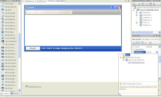
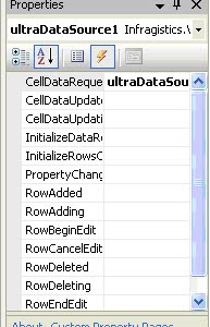
Next you’ll need to add UltraDataSource component in the form
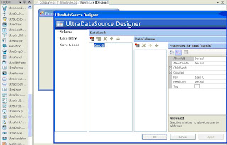
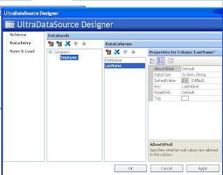
Here UltraDataSource Designer is used in order to define DataBounds (tables), their relationship and their DataColumns (fields).


Now You’ll define a DataBand called Company with a single DataColumn called CompanyName.


Next, you will define a DataBind called Employee with two DataColumns: FirstName and LastName.


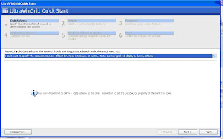
Next, you will add an instance of the UltraGrid control and bind it to the UltraDataSource component.
Click on the Finish button.


The UltraGrid control is still selected. You will set its Dock property to Fill so that the UltraGrid fills the entire area of the form.
Click on the Fill option.
The UltraGrid control provides two load styles: PreloadRows and LoadOnDemand. In this exercise, you will use the LoadOnDemand option.
Expand the DisplayLayout section.
Click on the LoadStyle down arrow.
Click on the LoadOnDemand option.
You bind the UltraDataSource component (with the schema that you defined) to the UltraGrid control by using the UltraGrid’s DataSource property.


using System;
using System.Collections.Generic;
using System.ComponentModel;
using System.Data;
using System.Drawing;
using System.Text;
using System.Windows.Forms;
namespace NestedTableUltraGrid
{
public partial class Form1 : Form
{
List<Company> companies = new List<Company>(100);
public Form1()
{
InitializeComponent();
}
private void Form1_Load(object sender, EventArgs e)
{
for (int i = 0; i <>
{
Company company = new Company("CN " + i.ToString());
company.Employees.Add(new Employee("FN " + i.ToString(), "LN " + i.ToString()));
companies.Add(company);
ultraDataSource1.Rows.SetCount(companies.Count);
}
}
private void ultraDataSource1_CellDataRequested(object sender, Infragistics.Win.UltraWinDataSource.CellDataRequestedEventArgs e)
{
switch (e.Column.Key)
{
case "CompanyName":
e.Data = companies[e.Row.Index].StrCompanyName;
break;
case "FirstName":
e.Data = companies[e.Row.ParentRow.Index].Employees[e.Row.Index].StrFirstName;
break;
case "LastName":
e.Data = companies[e.Row.ParentRow.Index].Employees[e.Row.Index].StrLastName;
break;
default:
break;
}
}
private void ultraGrid1_BeforeRowExpanded(object sender, Infragistics.Win.UltraWinGrid.CancelableRowEventArgs e)
{
ultraDataSource1.Rows[e.Row.Index].GetChildRows(0).SetCount(companies[e.Row.Index].Employees.Count);
}
}
}
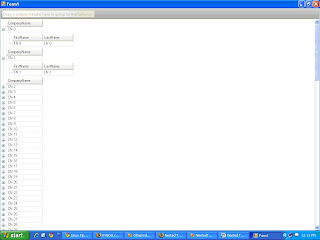
Run the application expand the blocks and check the Output